Transport
Transantiago | Development of the Official Typeface System
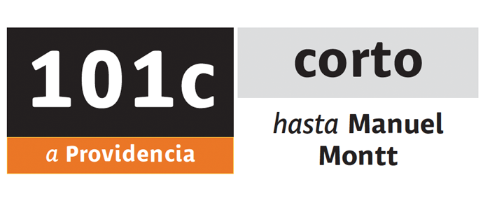
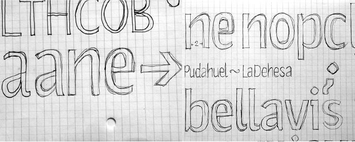
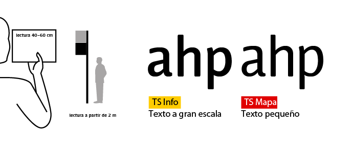
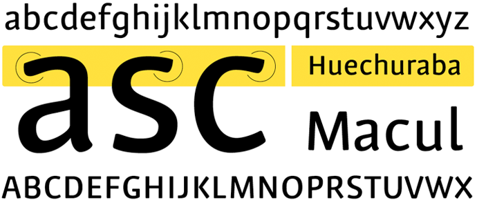
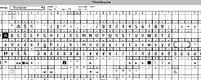
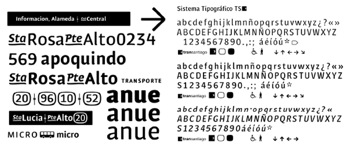
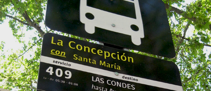
Creation and implementation of Public Transport System of Santiago’s official typography. The development took into account the traditional elements in the lettering of transport signboards. It also included common language use in Santiago, such as well-known abbreviations of landmark names. Initially the typographic family had three variants: TS Info for its use in large-size elements; TS Mapa for small sizes; and TS Picto for symbols related to public space and system management. Each font had several weights and variants to which font programming elements were later added. This resulted in the termination of the TS Picto variant
