Identity
UC Emblem | Official University Emblem Update
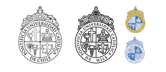
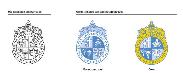
Revamp of Pontificia Universidad Católica de Chile’s official emblem. The emblem was thoroughly examined in order to re-draw its graphic components in order to improve a more harmonious relation between the symbols. The team also redefined the emblem’s formal structure so it could be used in a variety of supports, as well as in several color alternatives and scales.
This optimization was carried out together with a typographic analysis of Trajan, the institutional font aimed at improving its legibility.
